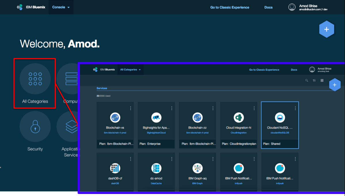
We have been listening to your feedback on the Bluemix UI and have used that to design a brand new user experience (UX) that we believe will streamline your workflows. The new experience is now live for your immediate use. When you visit the Bluemix UI, you can choose to opt-in for the new experience via a “Try the new Bluemix” link in the header bar:

In this blog, we’ll walk you through the new taxonomy organizing your resources, the redesigned catalog, the updated flows for creating new compute resources, the reorganized app details page, and more!

Original blog post co-authored with Amod Bhise.